
🎭 The Mood Beneath the Surface: How Tonal Shifts Shape Emotional Response
- Ian Miller

- Aug 25, 2025
- 2 min read
Updated: Aug 26, 2025
A photograph doesn’t just show—it suggests. It whispers, provokes, comforts, or unsettles. And one of the most powerful tools in this emotional dialogue is tone. Whether in print or on screen, tonal shifts—those subtle changes in brightness, contrast, and shadow—can dramatically alter how an image is felt.

🧠 The Psychology of Tonality
According to emotional theory, tonal range interacts with our primal instincts. Light and dark aren’t just visual—they’re symbolic.
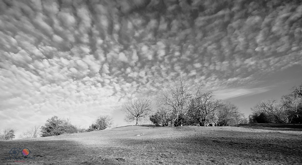
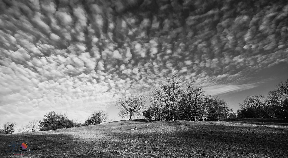
High-key images (bright, low contrast) often evoke feelings of openness, innocence, or serenity. Think soft portraits, airy landscapes, or minimalist compositions.
Low-key images (dark, high contrast) tend to stir intensity—mystery, melancholy, drama. They invite introspection and tension.
Balanced tonality offers neutrality, grounding the viewer in realism and subtlety. It’s often used in documentary work to maintain emotional honesty.
These tonal choices aren’t just aesthetic—they’re emotional cues. They guide the viewer’s subconscious response before subject matter even registers.
🖼 In Print: The Emotional Impact of Physical Tone
When tone is rendered in pigment ink on paper, it gains physicality. The tactile surface—matte, gloss, textured—interacts with ambient light to deepen or soften the emotional impact.
A low-key print on baryta paper under directional lighting can feel cinematic, almost theatrical.
A high-key image on matte cotton rag in soft daylight might evoke nostalgia or calm.
Even subtle shifts—like warming the shadows or lifting the blacks—can change the emotional temperature of a scene.
Viewers often describe these tonal impressions in emotional terms: “haunting,” “gentle,” “tense,” “hopeful.” The tone becomes the mood.


🪞 The Subject-Tone Relationship
Tone doesn’t work in isolation. It’s relational. A joyful subject rendered in low-key tones might feel ironic or tragic. A somber scene printed in high-key might suggest resilience or detachment.
This interplay invites deeper engagement. Viewers aren’t just observing—they’re interpreting, feeling, projecting.


🧭 Why It Matters
For photographers who print with intention, understanding tonal emotion is essential. It’s not about technical perfection—it’s about resonance. It’s about crafting an experience that lingers.
Tone is the emotional architecture of an image. It’s the difference between a photograph that’s seen and one that’s felt. And in the quiet space between light and shadow, the viewer finds their own story.
Would you like to explore how sequencing prints in a series affects emotional pacing next? That’s another layer worth unfolding.


Comments